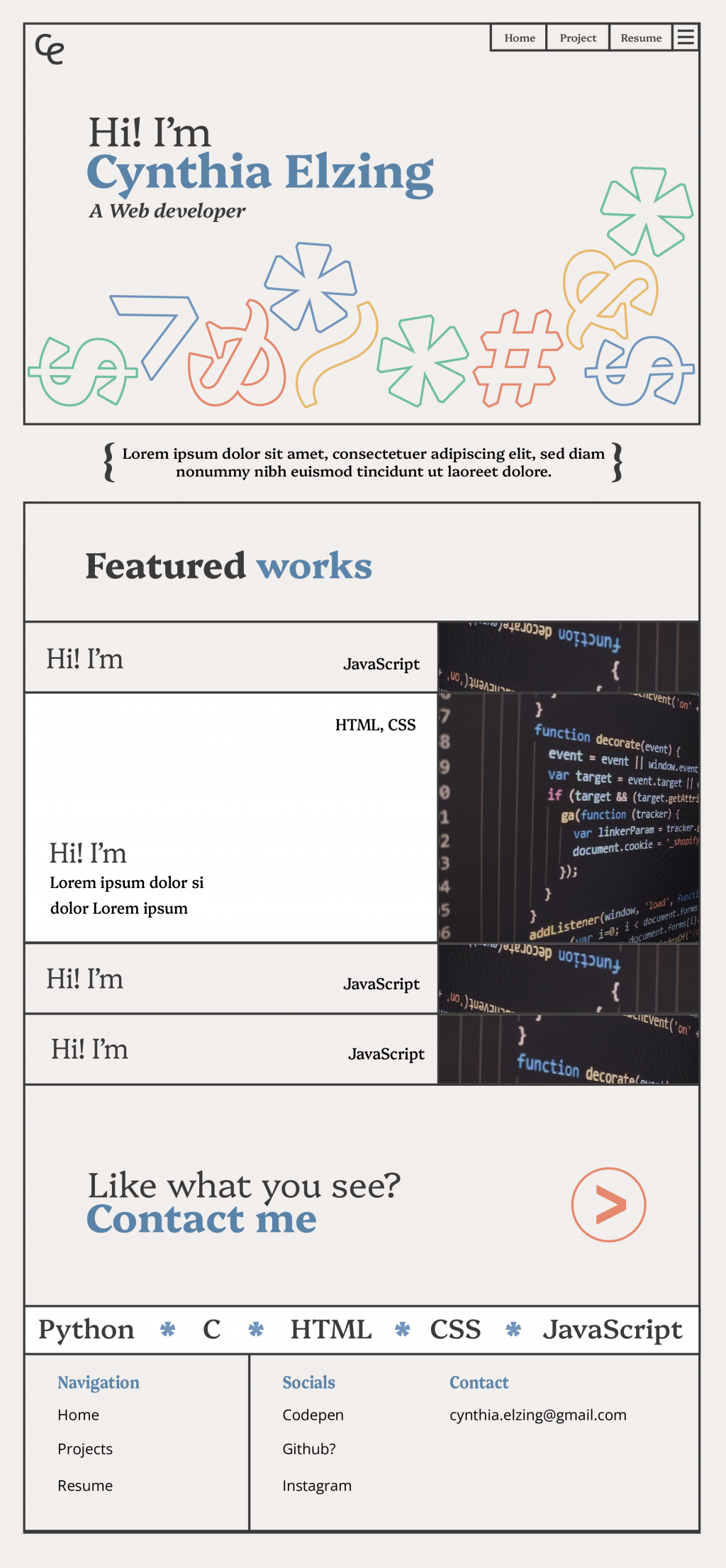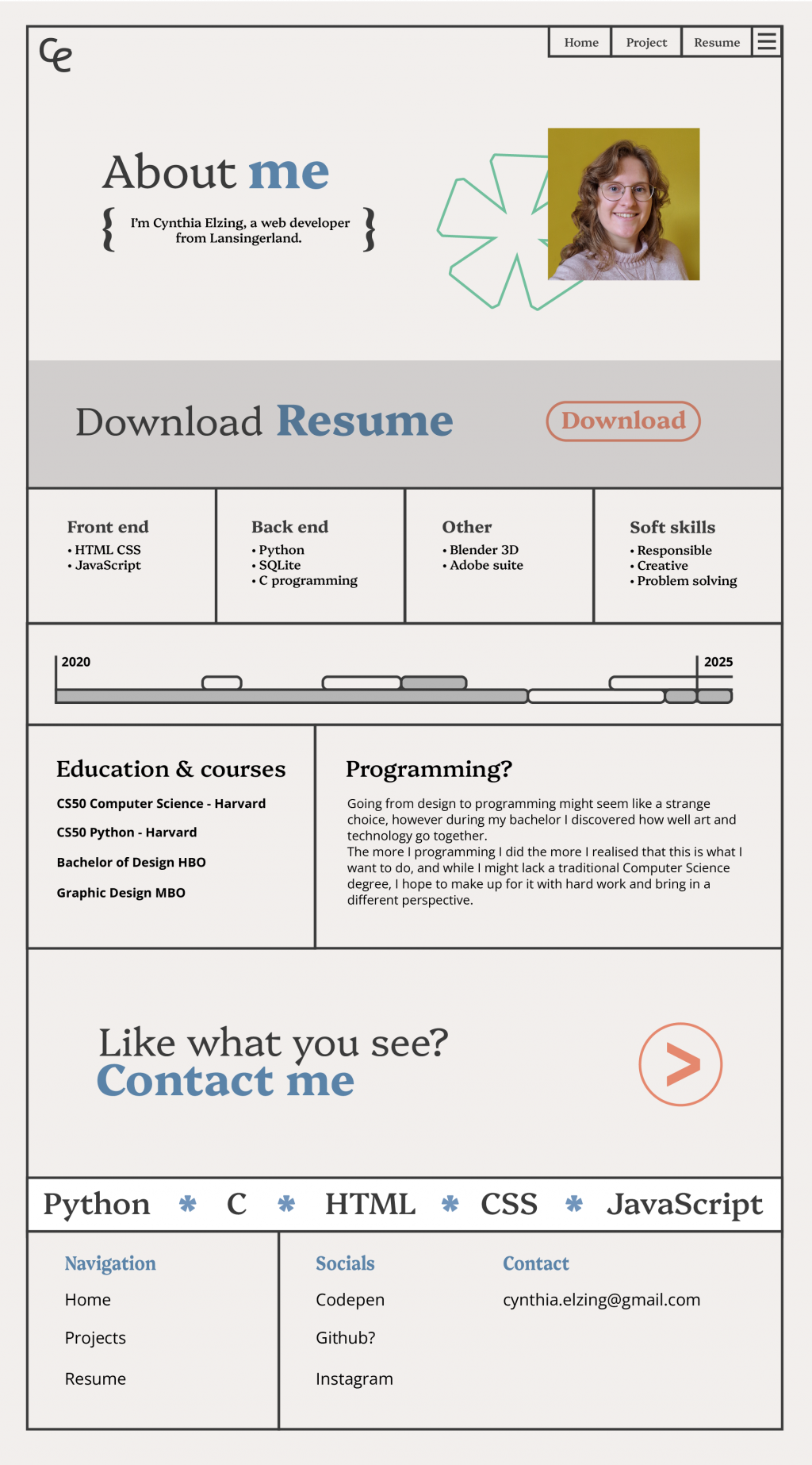
Since this style was mostly going to be used for the website I created the branding and the website layout somewhat simultaneously.
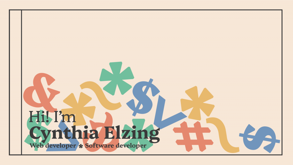
For the main page header I wanted a fun, striking and interactive element. I concidered having paralax images, something fluid or something animated. In the end I chose to go for something dragable; fun elements you can throw around the screen.
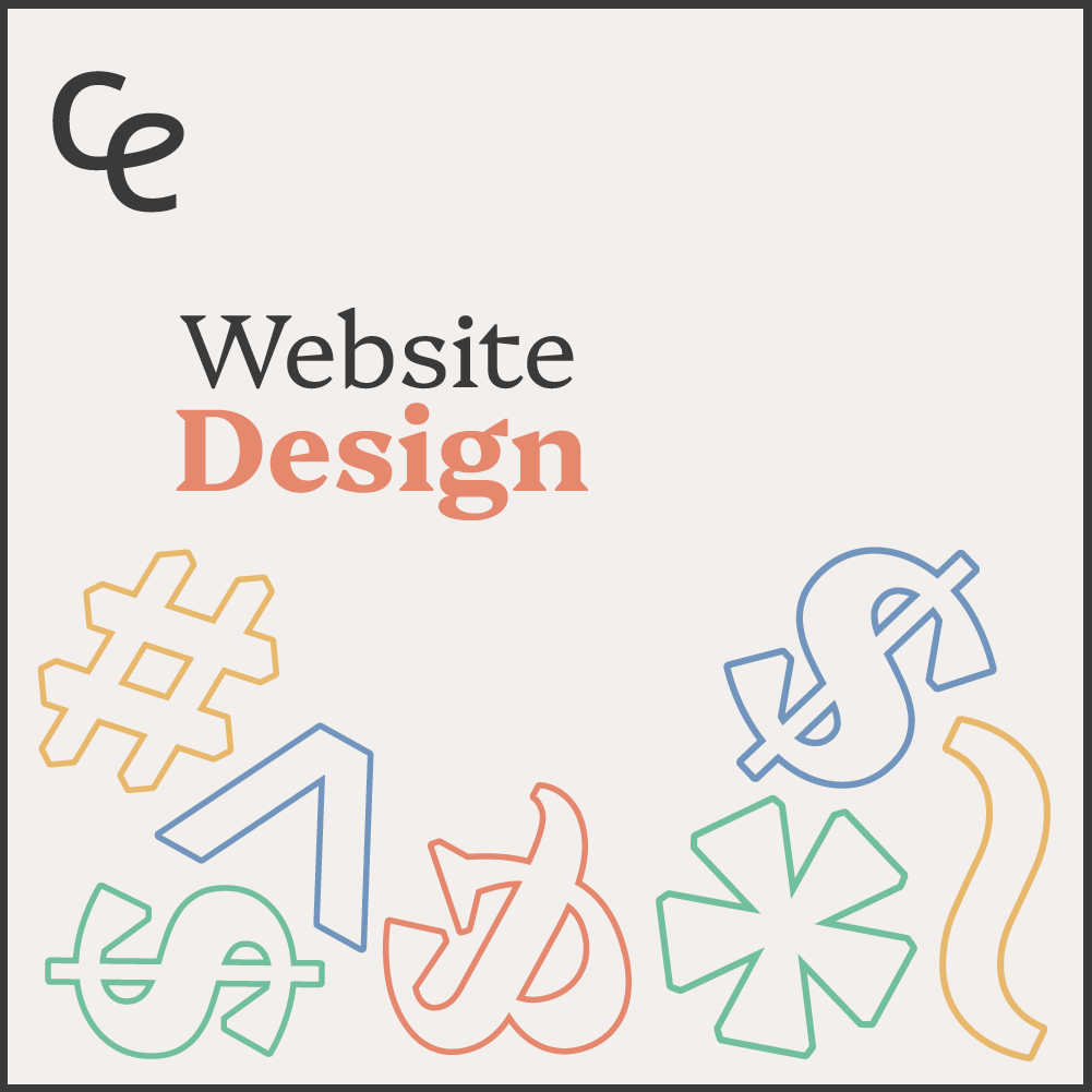
The Branding
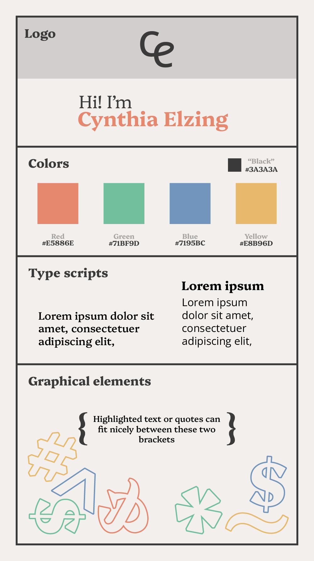
In order to have a consistent brand I created a Brandkit. The overal theme is graphic design meets programming.
Typeface
For the main font I chose one that stands out and is readable. For normal text I chose a simpeler font.
Colors
Since I will use this brand mostly for a website I decided on gray as a neutral background color so users don’t have to stare white light. Gray also won’t clash with any content on the site.
As accent colors I picked four colors as a fun nod to the primary colors of paint + green.
Shapes
I used symbols as graphical elements since these are used in programming aswell.
The finished website